Logo Simplification
[ Case Study, Not Used for Commercial Purposes ]
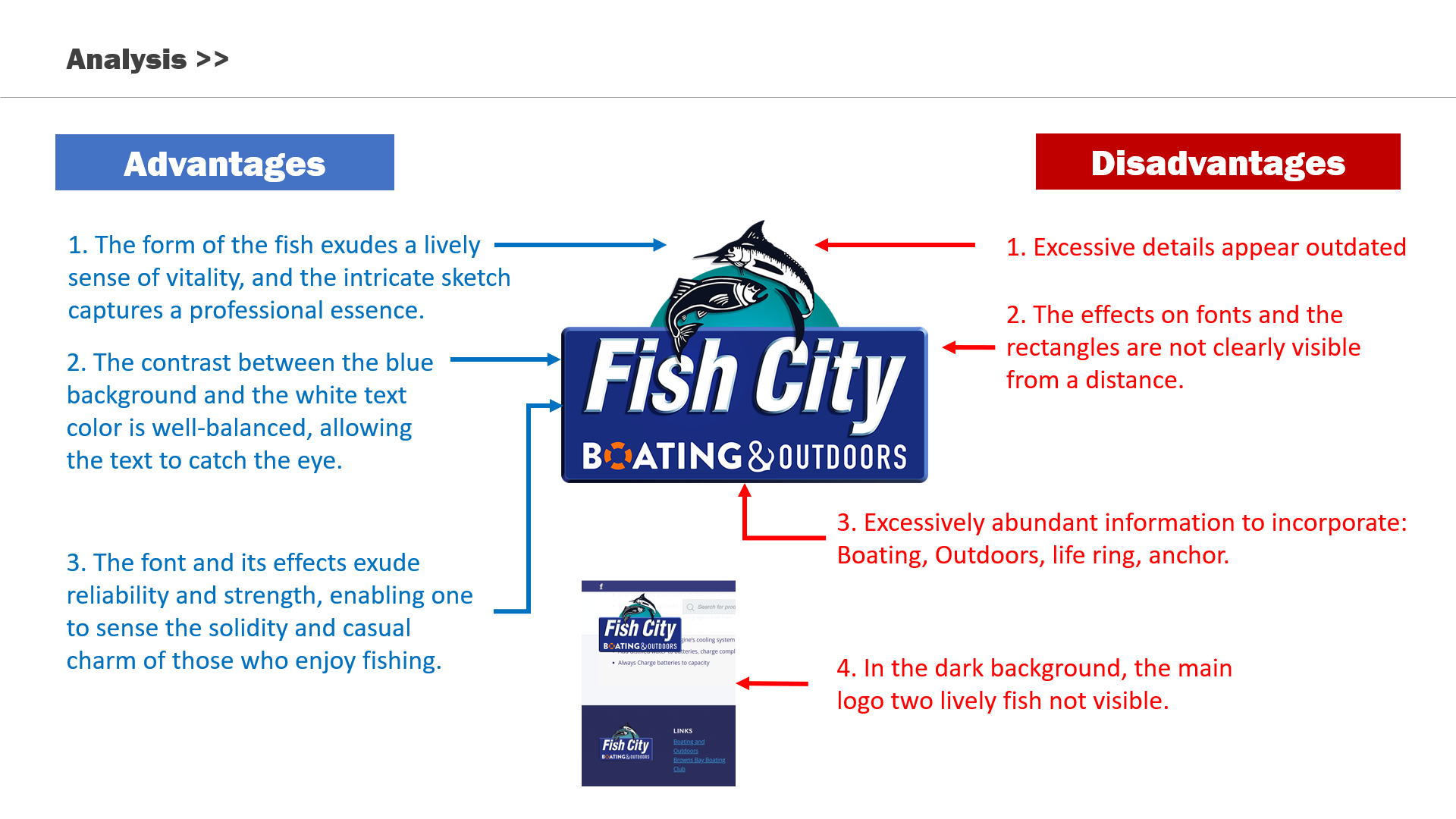
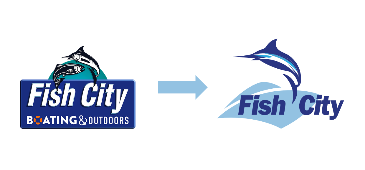
To breathe new life into the brand with a vibrant, two-spot-color logo redesign, the focal design element remains the blue marlin. Explore a logo redesign that considers the target audience and aligns with the core values of the business.


Design Solution
During the simplification process, I redesigned the essential elements of the client's business, the blue marlin and boat, using the Golden Ratio. For the font selection, I opted for a condensed sans-serif typeface that ensures excellent readability and conveys a strong and impactful impression, taking into consideration the target audience.


© 2023 Lisa Kim